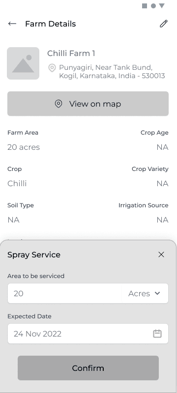
Bottom modal For all Input
Adopted Bottom modal for any input related action across all the three applications
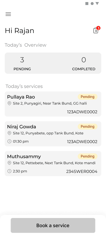
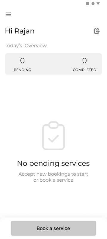
Driver home screen
The screen divided into two main sections Today's overview and services. The CTA is to alllow driver to make a on the spot booking for a new farmer
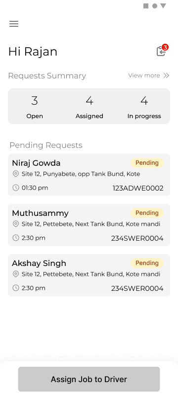
VLE home screen
The screen divided into two main sections requests summary and pending requests. The main CTA was to direct VLE to attend the pending request immediately.
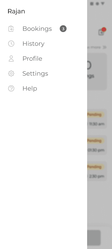
Side menu to access other items
A side menu was considered to be access to other items but eventually some items got transferred to bottom nav.
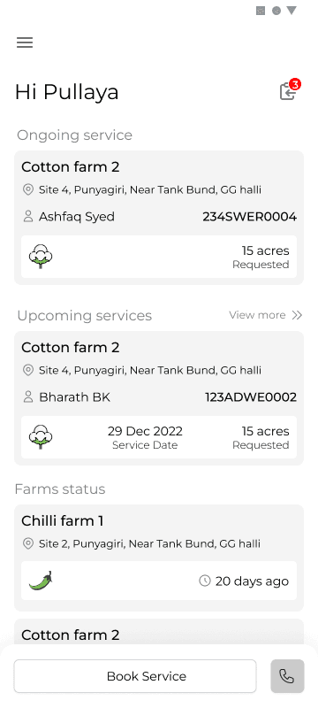
Farmer home screen
The screen divided into two main sections on going services and upcoming services. Each of the cards designed to contain the information pertaining to the farm and the request.
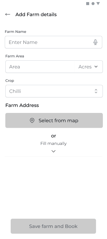
Adding Farm details
Keeping the context in mind even though a lot of information regarding the farm is important we dropped down to just three mandatory fields
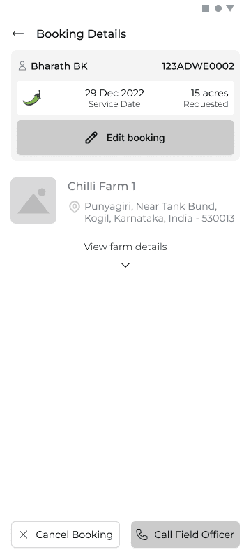
Booking Details Screen
Booking details and corresponding farm detail to be shown.
Two CTAs one for cancelling booking second for Calling VLE for any sort of support/query.
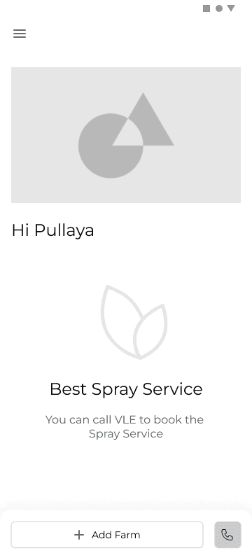
First time log in home screen
The first iteration was to have one CTA for contact and adding farm as that is the only action required to be taken. Designs were started out without a bottom nav bar so that it clearly directs user towards a certain action . However this was changed later.
First time log in screen for driver
Design decision for the partner app was to show stats upfront which would help in making a decision
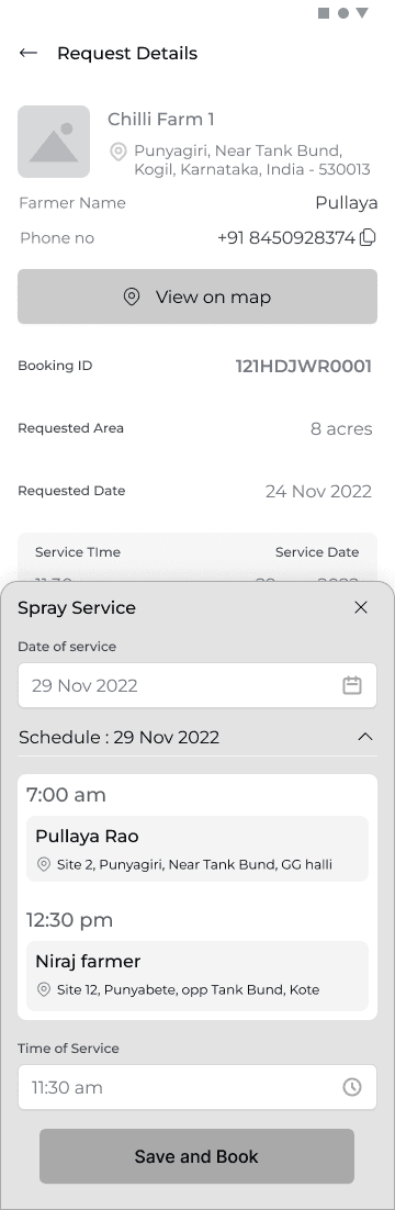
Checking the request
The screen shows all the relevant information regarding the farm and the request. Requested area, date farmer detail
To accept a request the driver has to input date and time as per his schedule.
A snapshot of this schedule for any selected day is shown to help driver make a decision.
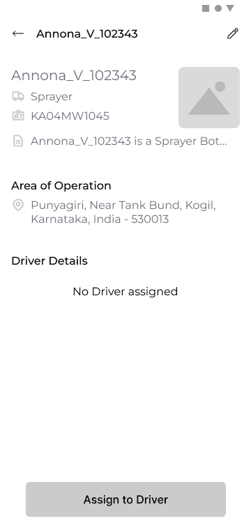
Bot Details
Bot details shows ID of the bot, Area of operation, Driver details
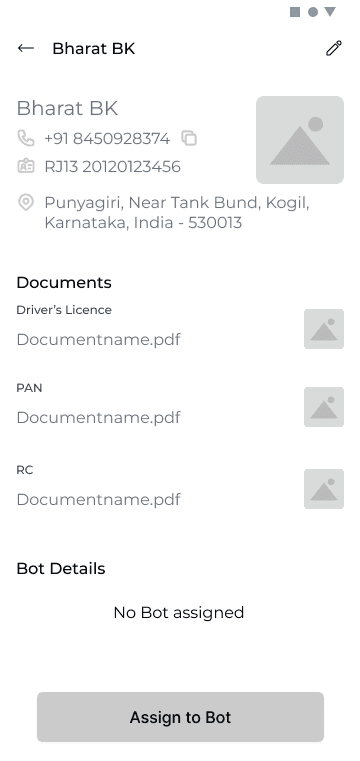
Driver Details
Driver details shows ID of the driver, Area of operation, Bot details and documents
First time log in home screen
The first iteration was to have one CTA for contact and adding farm as that is the only action required to be taken. Designs were started out without a bottom nav bar so that it clearly directs user towards a certain action . However this was changed later.
Close
WIREFRAMES
Following are a few unique screens which show the design decisions taken forward for various use cases , scenarios. Rationale behind adopted design paradigms. Note that these are few out of 150+ screens.